Horizontal Picture Graph Worksheets
How to Read Horizontal Picture Graphs - Whenever you go on to study math, do you think that the subject is boring? Well, everyone thinks that there is not a single thing about math that makes sense and could b fun or interesting to study about. But that is not true! Math has its fair share of exciting topics that is actually remarkably interesting and very fun to learn about! Have you heard about what picture graphs are? More importantly, do you know what graphs are? Let’s take a look at what they are one by one, and then we can move on to learn how you can read line graphs! A graph is a visual illustration of data that is too big and too complicated to be written in text. And a line graph is a type of graph. And trust us, picture graphs are so cool! There is so much that you can learn from looking at a picture graph. Reading line graphs is amazingly easy. There are two axes, the x, and the y-axis, that have the numbers and values. These values represent the data of the question, and the pictures represent the highs and lows. The greater the number of pictures, the greater the value, and the lower the number of pictures, the lower the value.
-
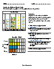
Basic Lesson
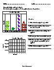
Leads students on the use of horizontal picture graphs by providing a supporting vertical graph. Use data from picture graph to make bar graph and answer the questions.
View worksheet -
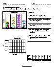
Skills Quiz
Students use the data from the picture graph to make a bar graph and answer 5 questions. If 6 more toddlers chose tricycle, how many total toddlers would have chosen tricycle?
View worksheet -
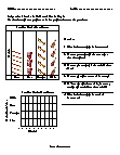
Independent Practice 1
Students examine data on a music themed picture graph. Include 6 questions and space for a bar graph. If 9 more people chose violin, how many total people would have chosen violin?
View worksheet -
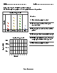
Independent Practice 2
Great practice for after school. Examples are provided. If 5 fewer people chose green, how many total people would have chosen green?
View worksheet -
Homework Worksheet
Students look at data from a recent survey on favorite vegetables. Favorite vegetable, we know, pure fiction! 2. How many more students chose tomato than chose broccoli?
View worksheet -
-
What's a Pictograph?
A pictograph uses pictures to represent data. A line graph shows change over a period of time. A line graph is also used to look for trends and make predictions. No matter which type of graph you use, make sure to document your data source.