Reading Picture Graphs Worksheets
What Are Picture Graphs? It is no wonder that what we see stays in our minds longer than what we hear and read. The use of images and pictures is something that makes learning impactful and exciting. Most students face difficulty while grasping the concepts of mathematics. How wonderful would it be if the things they learn or study are represented in the form of pictures? When it comes to graphs, pictures can play a significant role in helping students understand the data properly. A picture graph is a pictorial display of data using images, figures, symbols, and icons to present different quantities. The symbols, icons, and pictures represent complex data into simpler terms, display typical data, concepts, and ideas or stand-in for bigger and complex numbers. For example, in a graph, a single bird on the stick may represent the population of a million people in a city. The basic difference between a pictograph and a picture graph is that the former uses symbols to represent the items, and the latter uses actual images of the items being graphed. How to Make a Picture Graph - Graphs are an integral part of statistics, and they are frequently used in our day to day lives. There are a variety of different types of graphs, including line graphs, bar graphs, pie charts, histograms, and picture graphs. Each of these is used for a specific purpose and are utilized for different tasks. Picture graphs use pictures or symbols to display the data. It makes graphing fun and exciting for kids. It is much easier to read and understand. The symbols, pictures, or icons used in these graphs are a representation of an idea or a concept. These graphs were first used by ancient Egyptians. To make a picture graph, you need to decide the type of figure that you want to use to represent a specific quantity. Once you have decided, give your graph a title. The next step is to identify the dependent and independent quantities. The horizontal axis must represent the independent quantity and the dependent quantity will appear on the vertical axis. Label both axis with the quantity they are representing. You can use one symbol for a quantity and decide the number of units it represents. For instance, if you have to graph the number of lemonades sold every day in a week, you can use a lemon to represent two lemonades. You need to decide the scale in a way that it covers one-third of the grid.
-
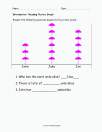
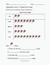
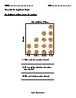
Basic Lesson
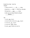
Students are taught how to read a vertical pictograph. Also includes practice problems. Answer the following questions based on the picture graph.
View worksheet -
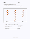
Intermediate Lesson
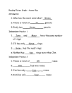
Students are taught how to read a vertical pictograph. Also includes practice problems.
View worksheet -

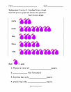
Independent Practice 1
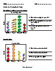
Contains 4 vertical pictograph sentence-based problems. The answers can be found below.
View worksheet -
Independent Practice 2
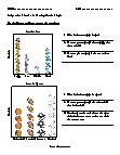
Contains 4 horizontal pictograph sentence-based problems. The answers can be found below.
View worksheet -
Independent Practice 3
Contains 4 vertical pictograph sentence-based problems. The answers can be found below.
View worksheet -
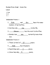
Independent Practice 4
Contains 4 vertical pictograph sentence-based problems. The answers can be found below.
View worksheet -

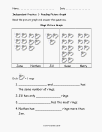
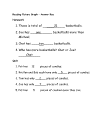
Homework Worksheet
Features 4 basketball related practice problems. Complete legend is provided.
View worksheet -
-

-
-
-
-
-
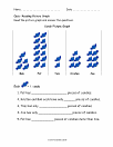
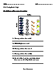
Basic Lesson
Leads students on the use of vertical picture graphs by the counting method.
View worksheet -
Independent Practice 1
Students examine a pictograph on favorite pets and favorite sports.
View worksheet -

-
-
-

-
How Do Graphs Help?
Graphs and charts are very useful because they communicate information visually. They can be used to make technical information easier to comprehend. This is why graphs are often used in newspapers, magazines, textbooks and reports. Accurate and easy to read graphics are very important in decision-making processes across all fields. They are so important in some cases, like launch time at NASA, that being able to rapidly read and interpret information can be a matter of life and death.