Making and Reading Line Graphs Worksheets
How to Read Line Graphs - Whenever you go on to study math, do you think that the subject is boring? Well, everyone thinks that there is not a single thing about math that makes sense and could b fun or interesting to study about. But that's not true! Math has its fair share of exciting topics that is actually very interesting and very fun to learn about! Have you heard about what line graphs are? More importantly, do you know what graphs are? Let's take a look at what they are one by one, and then we can move on to learn how you can read line graphs! A graph is a visual illustration of data that is too big and too complicated to be written in text. And a line graph is a type of graph. And trust us, line graphs are so cool! There is so much that you can learn from looking at a line graph. A line graph usually looks like a graph looks like a connect-the-dots puzzle; these dots and the line are actually a representative of the information. Line graphs can be straight, curved, or dotted! Reading line graphs is very easy. There are two axes, the x, and the y-axis, that have the numbers and values. These values represent the data of the question, and the line represents the highs and lows. The higher the line, the greater the value, and the lower the line, the lower the value. How to Make a Line Graph - The easiest of graphs present in the world of data manipulation and statistics is the line graph. A line graph is a figure which shows that the information is connected in some way. Such that, as we move along towards summer vacation, the graph of temperature will increase. While, in the opposite scenario, the temperature will decrease, as we move from summer to winter. However, it doesn’t necessarily mean that the graph can only move up and down; it can variate as well. For instance, if a student is in university, his or her grades can vary depending on his performances every semester.
-
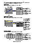
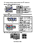
Basic Lesson
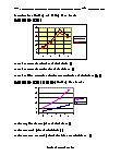
Using a random line graph students learn to field questions. Make a line graph using the data in the table.
View worksheet -
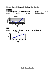
Intermediate Lesson
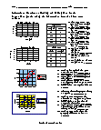
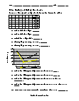
Students begin to answer higher level questions based on the line graph. What is number of literates at location B? What is number of illiterates at location D? What is total number of literates and illiterates at location D? 20 + 17 = 37
View worksheet -
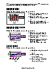
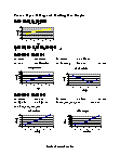
Independent Practice 1
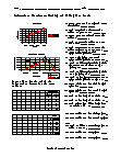
Students answer 10 questions using a random line graphs. Make line graphs using the data in the table.
View worksheet -
Independent Practice 2
The questions on this one see if they are paying attention to what they are reading.
View worksheet -
-

-
-
-
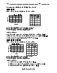
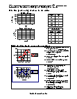
Basic Lesson
Using a random line graph students learn to field questions. Make a Line Graph using data in the table.
View worksheet -
Intermediate Lesson
Students begin to answer higher level questions based on the line graph.
View worksheet -
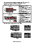
Independent Practice 1
Students answer 10 questions using a random line graphs. Create line graphs using the information from the first two tables.
View worksheet -
Independent Practice 2
The questions on this one see if they are paying attention to what they are reading. Which year had the highest sales of books?
View worksheet -
Homework Worksheet
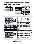
Offers 8 questions for home and provides two examples. Sample: Mark the X axis as week and place height of plant on the Y axis. Plot the graph with the data provided. 1. At the end of which week was the plant more than 6 CM tall? Week 4 2. Between which 2 weeks was the greatest increase in height? Week 3 & 4 3. How much did the plant grow from the 1st. to 2nd Week? 2 cm
View worksheet -
-
-

What Are They Used For?
Tne graphs are used to track changes over periods of time. When smaller changes exist, line graphs are better to use than bar graphs. Line graphs can also be used to compare changes over the same period of time for more than one group. A pitfall of a line graph is that it is possible to alter the way a line graph makes data look. This can happen when the author does not use consistent scales on the axes, meaning that the value in between each point along the axis may not be the same.