Using Tally Charts To Make Graphs Worksheets
How Can Tally Charts Be Used to Make Graphs? When you start learning statistics, a term that you will frequently come across is tally. So, what are tallies? Have you ever seen a data chart that is used to create a graph? It includes the object and a number that represents its frequencies, and you see a few lines beside it? Well, these vertical lines are what we term as tallies. It is a quick and efficient way to collect data. It is a faster method as compared to writing out words or figures. Moreover, it allows data collection in sub-groups which makes data analysis much easier. A single vertical line represents one unit, and after four, the fifth line is drawn horizontally, which cuts the four vertical lines. It helps you count the frequency, which then represented on the 1-axis of the graph.
-

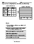
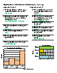
Basic Lesson
Students are walked through the steps to take a tally chart and create a vertical graph. Each line represents the number of occurrences or votes you recorded.
View worksheet -

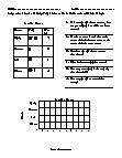
Skills Quiz
Students use a tally chart to create a graph and answer questions on favorite colors. If 3 more people chose red, how many total people would have chosen red?
View worksheet -
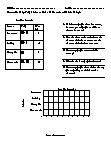
Independent Practice 1
Students examine a tally chart on favorite ice cream flavors. They produce a graph and answer questions.
View worksheet -
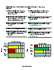
Independent Practice 2
Students examine a tally chart on favorite seasons of the year. They produce a graph and answer questions.
View worksheet -
-
-
Finding Meaning In Data...
Interpreting data means deciphering the information that you have. One way this information is disseminated is through tables, charts and graphs; all of which make the information easier to read and understand.