When you watch the news on television - particularly news that centers
of business and investing - you have probably noticed a number of
colorful graphics used to describe and track trends. These graphics
are generally graphs and charts and they are critical for clearly
conveying information in an easy to understand manner as well as in
a way that the difference between two different pieces of data is
clearly drawn. In a way, graphs and charts are illustrative methods
of clearly presenting various types of differences in a clear method.
Of course, not all charts and graphs are the same because certain
charts and graphs and more appropriate for one type of comparison
than another. These graphs/charts generally fall into three different
categories: line graphs, bar graphs and pie charts. Each of these
three has their own particular similarities and differences all of
which need to be examined for a better understanding.
A line graph provides a means in which to compare two different types
of information through showing how they are similar and how they are
differ. This is performed through the use two lines each representing
the two aforementioned pieces of information which are then charted
along a numerical scale. A common example of a line graph would be
two lines with one line showing the level of unemployment in the city
of Los Angeles and one line showing the unemployment in New York City.
The graph the lines run can represent the years 1978 to 2008 and the
"ups and downs" of the unemployment rate of each city over the course
of 20 years can be accurately compared.
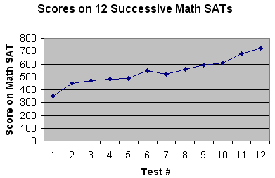
Line Graph Example
A bar graph is very similar to a line graph in the sense that it
is designed to show different values of two or more subjects but instead
of using lines it using horizontal and vertical bars that represent
a different value. There are numbers along the side of a bar graph
and they are scales identical to what would be found on a line graph.
In a way, this type of graph is somewhat easier to read than a line
graph and it conveys informational equally as well.
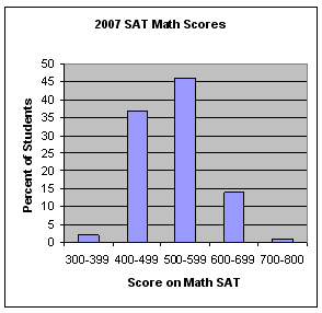
Bar Graph Example
A pie chart serves the same purpose of a line graph and a bar graph
in the sense it is designed to show differences between two separate
subjects although it eschews the common linear style found in the
two other graphs. A pie chart is a very common type of graph that
is in the shape of a circle with the circle representing a collective
of 100%. Then, within the circle smaller percentage portions within
the 100% will be presented in different colors. Sometimes the shapes
look like slices taken out of a pie and this is where it gets the
nickname of a pie chart. An example of a chart could include a question
who likes to play Playstation III with the pie cut in half with 50%
colored to represent teens, and two 25% "triangles" representing children
and adults. It is probably the easiest chart to read and is commonly
used in marketing and business presentations.

Pie Chart Example
But what happens when you yourself are the person who is supposed
to create a chart? Which chart should you pick? Well, there really
is not clear cut answer to this question because the specific subject
matter, the format in which you are presenting the chart, the audience
in which it is intended and your own personal preferences will all
play a role in selecting a chart. But, no matter which chart you do
select each of these three is reliable and effective at communicating
critical information. So, you can't realize lose no matter which one
you pick!