Plots like histograms, stem-and-leaf plots, box plots and scatter
plots, are a way of looking at lots of related values without looking
at bunches of numbers. Plots are essentially pictures that help you
to quickly see how the numbers are related to each other. Even though
something has been counted, you may not care about the exact number
so much as you wish to understand a relationship.
Bar Graphs
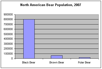
Perhaps you already understand about a bar graph. This bar graph
shows the population of different species of North American bears.
The numbers on the left side of the plot represent the bear population
and the titles on the bottom tell you species of bear. How many black
bears are there? There are 800,000 black bears. The bar graph is a
great way to compare how many.
Histograms
A histogram is a type of bar graph that shows how many of something
occurred, also called the frequency. A histogram looks like a bar
graph except that the bars are adjacent, that is, there's no space
between them. Without any space between the bars, you can see how
the counts or values are related to each other. Many times the values
will look like a normal distribution.
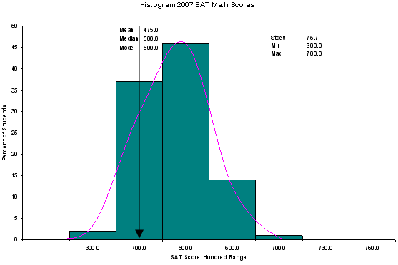
The SAT test is a test that many students take before they go to
college and many colleges decide who to accept based on the SAT score.
One part of the test focuses only on math and the test score ranges
from 200 to a maximum of 800. Almost all students score over 300,
most of the students score between 400 and 600, and the very best
students score 700 or more. Here is a histogram of the percent of
students taking the math SAT getting scores in each range of 100,
from 300 to 700. This histogram also shows the curve of the normal
distribution.
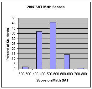
Here is the same information shown as a bar graph.
Stem-and-Leaf Plots
Another way to show frequency of data is to use a stem-and-leaf plot.
A stem-and-leaf plot is like a histogram turned on its side. When
you make a stem-and-leaf plot you use the values as they were recorded.
You take the first digit of the value as the "stem" and put it on
the left of the plot. Then you write down the rest of the digits of
each value on the right.
A sample stem-and-leaf plot for a group of students taking the math
SAT would look like this. Next to the 3 you put all the scores in
the 300's, next to the 4 you put all the scores in the 400's and so
forth. But instead of writing the complete score you just write the
last digits.
3 | 40 70
4 | 00 02 04 06 08 10 12 14 20 25 28 30 32 36 38 40 43 47
50 52 54 58 60 64 67 69 71
5 | 00 02 04 06 08 10 12 14 16 18 20 22 24 26 28 33 35 37
39 40 46 49 52 53 56 58 60 62 64 66 68 70 71 73 75 78 79
6 | 00 10 15 20 25 30 35 40 50 60 70 80 90
7 | 20
Box Plots
A box plot is also called a box and whisker plot and it's used to
picture the distribution of values. When you use a box and whisker
plot you divide the data values into four parts called quartiles.
You start by finding the median or middle value. The median splits
the data values into halves. Finding the median of each half splits
the data values into four parts, the quartiles.
Each box on the plot shows the range of values from the median of
the lower half of the values at the bottom of the box to the median
of the upper half of the values at the top of the box. A line in the
middle of the box occurs at the median of all the data values. The
whiskers then point to the largest and smallest values in the data.
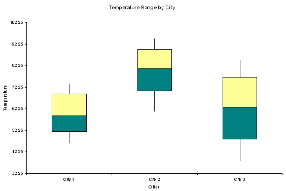
This box and whisker plot shows the temperature range of some unnamed
cities in the United States. Can you see that City 2 has the warmest
weather? Does it make sense to you that City 3 has the most variable
weather? City 3 must have cold winters and hot summers. Why? Look
at the range of temperatures at the end of the whiskers.
Scatter Plots
A scatter plot is an excellent tool for comparing pairs of values
to see if they are related. Scatter plots are frequently used by researchers.
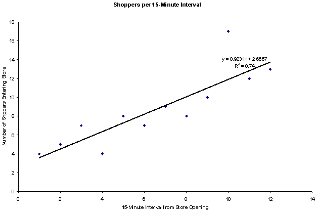
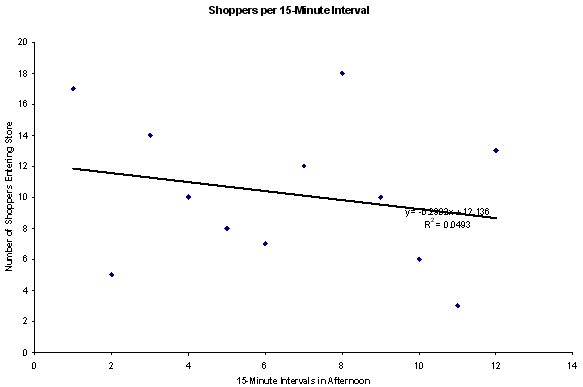
Let's pretend that you are researching shopping trends; you want to
know when during the day people shop in your store. You station someone
at each door to count how many people enter the store at 15 minute
intervals. So you count how many people come in between 9:00 and 9:15,
9:15 to 9:30 and so forth.
After the survey you plot the data for a 3-hour period which gives
you 12 points on the scatter plot based in 15 minute time slots. Let's
say the scatter plot looks like this for data gathered in the afternoon.
There doesn't seem to be any relationship between the time period
and the number of shoppers.
This time you measured the number of shoppers for the first 3 hours
after the store opens. This time you can see that the number of shoppers
entering the store in the morning steadily increases. The scatter
plot shows you the trend.