Pie Graph Worksheets
What Are Pie Graphs?
The pie graph or pie chart is a special chart that uses slices to depict relative sizes of data. The chart is divided into different sectors, which determines the size of different values. The value of the entire pie is 100 percent. Now let's take an example.
The following chart shows the water usage in our homes.
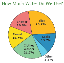
Now, if we add the values of percentages, the value we will get is 100. This is probably the most used chart by organizations, given that it is easier to understand, and it shows us an exact percentage of data available in our sample space.
-
Basic Lesson
Using a snap shot of a random pie graph students learn to field questions. The graph below shows the total hours per day worked by a group of employees for each month.
View worksheet -

Intermediate Lesson
Students begin to answer higher level questions based on the pie graph. Make a Pie graph for each set below. 1. Convert the data into percentages. 2. Multiply the percentage by 360 to get an angle. 3. Use compass to draw Circle. Draw radius. Place protractor on the circle so that 90 degrees are exactly above the center of circle. 4. Draw the section by using angles. Each time you add a section the radius to the line you just drew.
View worksheet -
-

Independent Practice 2
The questions on this one are to see if they are paying attention to what they are reading.
View worksheet -

-

-

-

Parts and Wholes
A circle/pie graph can be used to compare the relationship of the parts to the whole. pie graphs present data as percents or fractions of a total. The total must be 100% or 1. A pie graph is divided into sectors made by a central angle.