Reading Histograms Worksheets
What Are Histograms?
Among the different graphs provided to us by statistics, the histogram is the most widely used one. This special form of bar chart enables us to represent data comprehensively in discrete categories. In other words, the histogram does not have any gap between the columns to represent different categories.
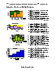
It is similar to a bar chart, but histogram groups numbers in the form of ranges. The height of each bar shows how many fall into each range. Let us consider an example to find the height of orange trees in the orchard. The heights lie between 100 cm to 350 cm. We will decide to put the results into a group of 50 cm. Now, let us look at the graph we made.
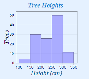
In the graph, you can see that there are 30 trees from 150 cm to just below 200 cm tall.
-
Basic Lesson
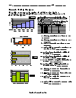
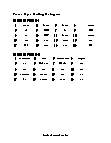
Using a snap shot of random data, students learn to read histograms. The discounts offered by super market are shown in the table. Represent the data in the histogram. 1. Set up the bottom axis (x axis- Amount). Look at total range of values and check the lowest value. Plot the range of values on axis. 2. Set up side axis (Y axisDiscount). Group up the values on the similar range of X axis (Amount). 3. Construct data bars centered over X axis.
View worksheet -
-
-
-
-
-
-
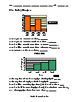
Two Bars?
A double bar graph is used for displaying categorial data. If the data are grouped into categories, such as makes of automobiles, school subjects, or types of movies, it is called categorial data. Double bar graphs are used for comparisons between 2 groups.